Start with what stays
Flooring, counters, cabinets, tile and large furniture are hard to change, so they set the starting point for color. Look at their undertones: warm, cool or neutral.
Choose paint that works with these fixed elements, not against them. A gray with the wrong undertone can make wood floors look orange or a white look yellow.
Take photos of the room and keep fabric or tile samples nearby when you look at colors.
Take a photo of your room in daylight and in the evening, and keep it handy when you look at samples. Photos are not accurate for color, but they help you remember what you liked about the room.
Understand light
North-facing rooms get cooler, softer light, while south-facing rooms get warm, strong light. East rooms are bright in the morning and west rooms glow in the evening.
Lamp light is warmer than daylight, so a color looks different at night. Check samples at several times of day.
Rooms with little natural light often look best with colors that are not too dark unless you want a cozy feel.
If your room has little natural light, avoid assuming that a very light color will always look bright. Some light colors look gray in dim rooms, so test them before committing.
Test large samples
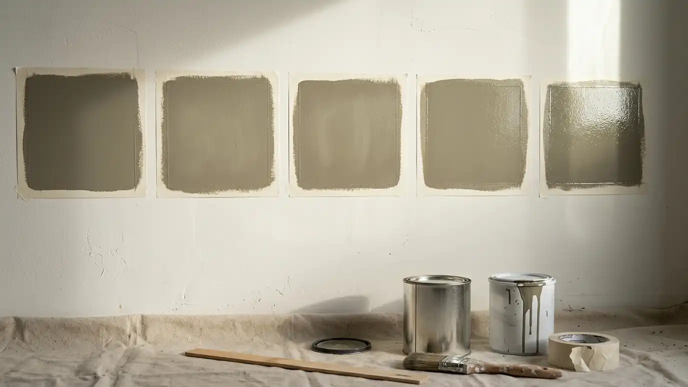
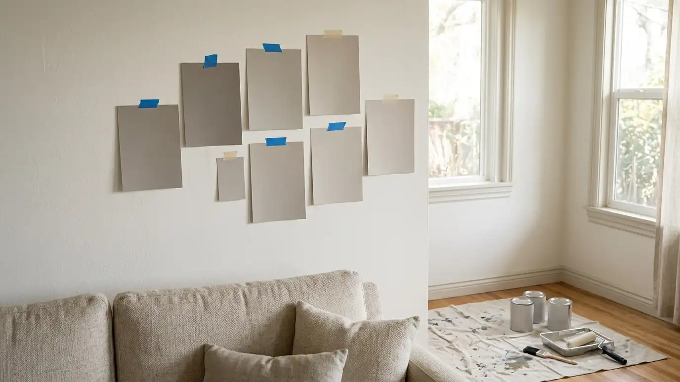
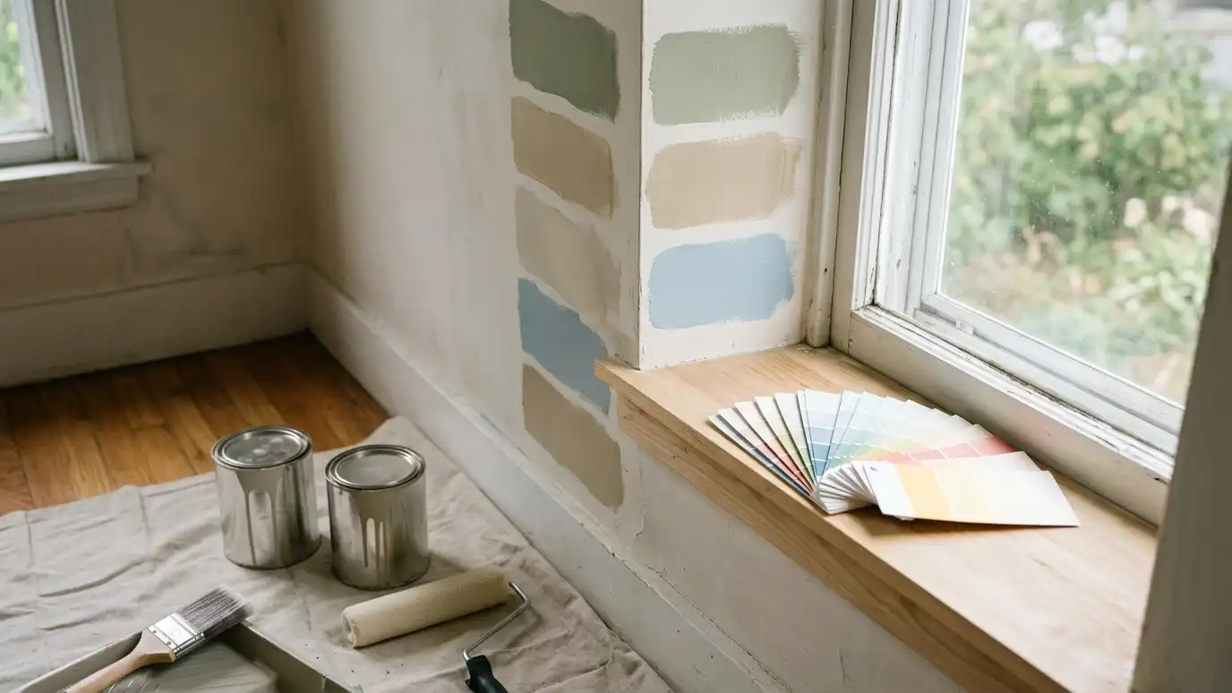
Paint large samples on two walls or use movable samples. Put them near trim, floor and furniture. Leave them for a few days and look at them in different light.
Compare finalists next to each other. Eliminate what you do not love, and trust your reaction.
Tiny chips mislead. A color can look completely different at full size.
Do not judge a sample on a white board against a white wall. Paint a large square, leave a white border and see how the color behaves next to your floor and trim.
Pick the sheen
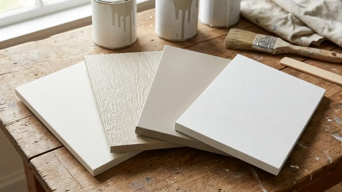
Flat hides flaws and suits ceilings. Eggshell and satin are popular for living areas. Semi-gloss suits trim, doors and baths. Higher sheens look different from the same color in flat.
Test sheen with your color, since gloss changes how a color feels.
See our paint types and sheens guide for more.
If a sheen looks too shiny in the sample, step down to the next level. Most walls look good in eggshell or satin, and flat is best reserved for ceilings and rooms where flaws need hiding.
Plan trim and ceilings
Trim and ceilings frame a room. White trim is classic, but trim can also match walls or contrast for impact. Ceilings are usually white or a lighter tint of the wall color.
Choose whites with care. Warm whites feel cozy, cool whites feel crisp, and neutrals are in between.
Think about doors and cabinets as part of the plan.
Trim color is easier to choose when you look at doors, cabinets and built-ins together. Decide whether you want crisp contrast or a soft, tonal look, and test accordingly.
Create flow
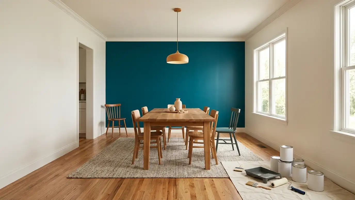
In an open home, colors flow from room to room. Choose a main neutral and a few accents rather than many unrelated colors.
Repeat colors in a few places, such as trim or an accent wall, so the home feels connected.
We offer color consultation if you would like help, and we are happy to work with any paint brand.
When in doubt, start with the room you see most. Once it feels right, other rooms can borrow its colors or complement them, and the whole home feels planned.
Start with what stays, test large samples in your own light and choose the sheen along with the color.